Quantcast
Channel: Acme Punched! A 2D Animation Blog
Viewing all 184 articles
Browse latest View live

When Good Enough Isn't Good Enough: Pursuing Excellence

$
0
0
The fox on the man's head.
If you have read my previous posts, you will see that I have shown some examples of improving my own work.  In the animation business, as in many others, one cannot always do that.  There are many good reasons for this.  Sometimes the budget is too tight, or the screen time allowed for some bit of action is too short, often dictated by the timing of a script that is already locked down.  Very often,  a short deadline does not permit the careful planning that might make for better animation and storytelling.

Perhaps these are excuses rather than reasons.  In any event, I have spent most of my career doing work that was good enough.  It was good enough for my clients and good enough to give me a career doing animation in TV commercials, video games, and now for the internet.  I have done work where there was no time for pencil tests or for doing anything over, and it has been good enough.  And--don't get me wrong!--much of it has turned out very well.

And yet, I have done some animation I cannot bear to watch anymore and which you will never see on my demo reel.  (I think most serious creative people have work that they personally do not like to look at, even though others may admire that work.)

Also, in television commercials and other short work that I have done, there has never been time to develop character or to have very much character interaction.  There was seldom more than one character on screen at a time.  Therefore I never professionally had a chance to develop my character animation skills to their highest level.

When I began work on my current personal film The Crossing, my attitude at first was as usual:  to make it "good enough."  So I have completed the pencil animation on a good portion of it at that level.  At some point, though, I asked myself why I was doing that.  Why was I only making it good enough, when I now had the time to make it as good as it could possibly be?  I decided I wanted it to be excellent, even if that meant doing some work over again.

Thus, we have the basis for this blog:  a series of examples of "good enough" animation being improved; being made as good as I can make it.  I hope you will stay with me and perhaps benefit from the process of re-thinking all of these little scenes along with me.

Next:Problem 3: The Fox On the Man's Head


Problem 3: The Fox On the Man's Head (Part 1)

$
0
0
First, you will need to understand the story at this point.

The Story: 
The man has arrived home to present 3 things to his wife.  He has already given her the goose and a bag of grain.  But he has concealed his third purchase as a surprise: under his hat, perched atop his head is a live fox.

In problem 2 we saw how he pulled his hat off, using the stagger effect.  Now we see the fox, his ears down and his tail tightly furled around his body, so that the man's wife is not sure what she is seeing.

The Scene:
Closeup.  The fox uncoils his tail and shakes himself out.  The man reacts in a subdued "take" at the movement of the fox.

The First Version:
In my first pass, I had the man reacting with alarm as the fox uncurled.  Here is the pencil test of that:
Pencil Test 1

In fact, the first test had the man waiting until the fox was completely uncurled before he reacted.  This was poor planning, a too literal interpretation of the rule of thumb that the movement of a secondary character can draw the viewer's attention away from the main movement of the primary character.  Often that means to have only one character moving at a time. But I realized it doesn't work well for the man to wait all that time before reacting to the movement of the fox; he should logically react right away.  Therefore as you see above, I have moved his reaction up to the beginning of the movement of the fox.  This is better, but still, it does distract.

What would be a better solution?

In watching the movement of the fox (which I am basically happy with), I realized that it would be more effective to have the tail begin to unwind much more slowly, then time the man's reaction to happen with that.  Thus the man will be at rest (and not distracting us) by the time the fox goes into his more violent movement.

There are two other things I am going to change here.  First, the shot was to be a wide view as you see in Pencil Test 1.  Since planning that, I have had more experience in Toon Boom AnimatePro, and found how easy it is to use a Camera Module.  I decided I wanted a tighter closeup, excluding the wife from the frame, more like this:


The other change is to the man's reaction itself.  Instead of being alarmed by the fox's movement, he should react only a little here, with an expression more of delight than of uncertainty.  Notice that I have the man's head moving very little, because I want the fox to remain fairly stationary.  I will stay with that constraint, mostly moving his shoulders instead of his head, and giving him that more pleased expression.

Next: Problem 3: The Fox On the Man's Head (Part 2)  We fix the man's "take".

Problem 3: The Fox On the Man's Head (Part 2)

$
0
0
As stated, the first thing I want to do here is to change the "take" to something more subtle, and rather more amused than alarmed.  Here was my first try at the revision:

Better than before, but it still isn't quite right.  The arm movement overstates the reaction (not to mention that the framing will be a tighter closeup), and the eyes stay closed for too long.

Let's try again, letting the shoulders do the work and making the blink much shorter.  Here it is again:

Good; this is what I was looking for.  He just shows that he is aware that the fox is moving, without being too worried about it.

Next I will re-time the unwinding of the tail, slowing that down and also bringing it to a hold at the end after the body does, as it is seldom good to have everything stop all at once.

Next: The Fox Unwinds

Problem 3: The Fox On the Man's Head (Part 3)

$
0
0
[First, an apology to my readers for the long time between posts.  The fact that I was busy with other things does not mean anything when you feel that the blog you are reading has gone dead.  I intend to try to post at least twice a month, and more often if possible.]


Here I want to work on the beginning of the Fox's unwinding, slowing it down, making it more interesting, and making sure it works well with the little "take" or reaction  of the man to the tail movement.

Therefore I will only be showing the first part of the scene in this post.


Here is the first pass at improving the start of the unwind:


I feel this doesn't work as well as it might because, although I have added some drawings to the tail movement to slow it down from the original, the man's reaction still distracts from the more important movement that I want the viewer to observe (that is, the fox shaking himself out).

What else might be done here?  What else is in our animator's toolbox?   Well, it occurs to me that I could add an anticipation to the tail unwinding.  This would not only make the movement more dramatic and suspenseful, but it would also add the extra time to the movement that I am looking for.

So I erase those few drawings--they are simple ones and not hard to replace--and begin again with a snappy anticipation.

Here is how that looks:

Okay!  I am happy with this; it is exactly the effect I wanted to achieve:
-The man's reaction seems to come at a natural time, as soon as he feels something moving.
-The anticipation works well to draw your attention to the tail, and it lasts long enough that by the time the man has come to rest, the viewer is ready to focus on the main business of the fox unwinding, and he hasn't missed anything important

A note on the anticipation:

I want to draw your attention to something a bit unusual about the anticipation.  Here are the key drawings: 1, 13, 17 and 25, shown with 2 spacing guides.

Note that I use Disney-style numbering, where the drawing numbers are also frame numbers whenever possible.  Thus, if drawing numbers are all odd numbers, it means the drawings are being shot on 2's.  (This technique is best described  by Richard Williams in his book The Animator's Survival Kit.)

Drawings 1 thru 13 comprise the actual anticipation--the movement that telegraphs and often opposes the forward movement.  Nothing unusual here; as the spacing guide shows, we ease out and ease in.

But I have dwg 13 hold for 4 frames (at 24 frames per second), so that the next drawing and number is 17.  Again, there are no drawings between 13 and 17.   This gives the movement its snap.  Also, I am playing with the apparent variable volume you get with hair or fur, where it can appear to be a smaller mass when wet or otherwise compressed.  Therefore 17 shows the hair suddenly all spread out.

The remaining inbetweens that fill in between 17 and 25 are a conventional ease in as the tail fur collapses down again.

Next:  Shakin' It Out

Problem 3: The Fox On the Man's Head (Part 4)

$
0
0

Shakin' It Out


Before doing the rest of the tail, which after all is a follow-through item, I needed to finish all necessary work on the body, lest the tail end up wagging the fox.

The two unresolved elements were: 1) how the fox sits down after shaking himself out, and 2) how his bristly fur settles down, and what kind of timing that called for.

Sitting Down

Previously I had only done key drawings.  Now I added in my inbetweens and got this:
This was good in most respects, but I thought the head turn, where he looks down, should hold longer.  (Remember, we are more-or-less ignoring the tail for now.)

I altered the timing so that he is looking down for 8 frames instead of two.  Here is how that looks:
Much better, and I am now ready to look at it together with the shakeout that comes before.  Also I now add detailed drawings showing his fur, which is all bristled out after the violent shake, settling down as he goes into his hold.

Here is all of that together:
All seems to be working.  Yet to do is the final timing, mostly on its own layer, of the tail itself, and then a test of the entire combined scene.

But first...

Next: An Analysis of the Shakeout Drawings and Timing

Problem 3: The Fox On the Man's Head (Part 5)

$
0
0

The Breakout of the Shakeout


Before we get back to the tail, I thought you might like a close look at the drawings involved in the fox shaking himself out after being matted down beneath the man's hat.  It involves drawings on both 1's and 2's, and also the use of multiple images.

Here again is a look at this portion of the sequence at full speed.  I remind you again, we are at this point ignoring the tail, which will now be on its own layer.


Now here is another  version of the same drawings, but this time with enough frames exposed for each that you can observe every drawing and its relationship to the others.


Up through drawing 61, the drawings are all exposed on 2's, with 61 itself being held for 4 to stress the anticipation.

Then 55 through 78 are on 1's, after which we return to 2's with 79 through 85.

The drawings with two heads each--66, 69, 72 and 75--are used where the fox whips his head across from one side to the other, spanning a distance where there can be no overlap of forms of the head.  In such a situation, some artifice is usually advised to help the viewer bridge the gap between the widely spaced drawings.  This might be a blur, a smear, a trail of speed lines arcing across, or, as in this case, the use of multiple positions of the moving object on one drawing.   (Note: The trailing heads on drawings 69, 72 and 75 are drawn in red only to make them stand out in the pencil drawings from the blue lines that they cover.)

Note that the head in the drawing following each of these is very closely related to the forward head of the multiple drawing; it is advanced just a little more, and the ears continue forward in a follow-through.

Mine is only one way that this might have been done.  There are many ways of convincingly  animating a quick motion like this, and therein is the joy and intrigue of animation, that although it is possible and useful to work with formulae, one may also invent something new that may be more effective than the old. 


Next:Tail and All: The Full Scene Put Together


Problem 3: The Fox On the Man's Head (Part 6)

$
0
0

Head To Tail: : Putting It All Together


Because I have up to four layers here in the pencil test, I took the time to clean up all the drawings in black pencil so you will get the clearest possible view.   Here is the result.

This is about how I want it.  I will add  a couple of eye blinks to the man, but I will do this on the fly, in Toon Boom Animate Pro.  I will also add a camera move at the end, trucking in on the fox as he sits down.

This scene is ready to be inked and painted, and I have decided to go ahead and do that so you can see the final result and get the full production picture of a scene from rough pencil tests through final color.

This will take me a while, so in the meantime I will do a few posts on rare animation books you may never have even heard of.


Next: Animation In Twelve Hard Lessons

Rare Animation Books: Animation in Twelve Hard Lessons

$
0
0
The cover of the book, its title drawn in so ornate a style that one can hardly read it.
Animation in Twelve Hard Lessons was first published in 1972 by the author's own company, Robert P. Heath Productions, of Tampa, Florida.  I think I got my copy about 1980, and in those days before the internet, it is probable that I saw an ad for it in the catalog of Cartoon Colour Company of Burbank, California, which is still in the business of selling animator's supplies to this day (including, I must mention, animation paper which is acme punched.)

Bob Heath's one claim to fame was that he animated the short cartoon "The Critic" for Pintoff Productions.  With comic narration by Mel Brooks, this cartoon won the Academy Award for Best Animated Short Subject for 1963.

Heath subsequently ran his own animation studio and developed the book during this time.  Originally it was designed as a correspondence course, which means that students would enroll by mail, receive lessons by mail, and send in their work and receive corrections and comments by mail.  Complete the whole course of work, and you get a certificate of completion.  It is the same idea as was successfully carried out by such schools as the well-known Famous Artists School and is similar in concept to the online courses available from independent schools today.  However, I don't know if it was ever actually offered to the public as a correspondence course, or only as the book that came into my hands.

It was a large format book, 11" x 14" (28cm x 35.5cm) and 142 pages long, and it offered a practical education in basic character animation in a "limited animation" character design style that was fashionable in the 1950's and 60's,  more UPA than Disney.  After some introductory material about equipment, the 12 lessons included three on inbetweening, two on assistant animation, one on general animation, and then a chapter each on animation pans, the animation camera, tricks of the trade, animation actions, working with animation, and technical animation.

Each of the 12 chapters had exercises or problems to be solved, and each had solutions to its problems provided at the back of the book, thus maintaining the lesson and answer structure of the correspondence course.  My copy of the book is somewhat mutilated because of the necessity in doing the lessons of cutting up the pages to remount the drawings in register on animation paper.  But I have kept all the material together and haved taped the pages back together so that today I have virtually the whole book.
A typical page of illustrated instruction from Animation in Twelve Hard Lessons.

Personally I never completed all the lessons because by the time I got Animation in Twelve Hard Lessons, I had already learned many of these basic lessons elsewhere.  I don't know how many animators benefitted from this book, but I believe a person who had absorbed all its information would have been qualified for at least an entry level position at any studio producing animated television commercials in its time.

In addition to the book, I purchased at the same time the animation disc offered by Heath Productions.  It was manufactured of molded particle board with a frosted glass inset panel and movable Acme peg bars of black plastic with metal pegs.  I used this disc until I replaced it with the much cooler and more expensive aluminum disc I still use today.
The Heath Productions animation disc.  The only way to lock down the sliding peg bars was to tape them down...but it worked!
Although this book is long out of print, as of this writing there are several American booksellers offering used copies online.

Next: Getting Your Paper Animation into Toon Boom Animate Pro.


Drawings Into Digital: Part 1--Scanning

$
0
0

Paper To Digital: Getting Started


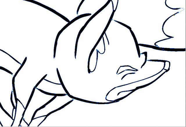
Having cleaned up all drawings for this scene in black pencil, next I scanned them into the computer for "ink and paint", the old expression for getting the drawings into final line and color form on a transparent field, just as in pre computer days they were actually inked onto acetate celluloid, their colors painted in on the back of the cel.  I have actually done this, and as an independent animator I mean that I--not some employee or underling--have actually done it.  Mixing paints, doing test cels to get the right colors, doing let-downs (compensating for the gray density of each cel by lightening the paint colors incrementally, so that the parts of one character on multiple cel levels would all appear to the camera to be the same color and value), waiting for the paint to dry, repairing damaged cels where the paint turned out not to be dry, and so on.

All that is in the past, and I am glad to embrace what computer animation can do in this area.

First step is scanning, and I recommend the ScanExpress A3USB 1200 Pro Scanner by Mustek.  It costs under US$200 and scans up to 11.7" x 16.5" (29.7cm x 41.9cm).  I learned about this scanner from a comic book artist friend and was excited, because all scanners I knew about  that scanned any larger than American legal size (8 1/2" x 14") were priced in thousands of dollars.

The Mustek ScanExpress 1200
This scanner works in a wide variety of resolutions and scanning modes, and it can batch-scan 10 copies at a time. I access it through Photoshop, where the scans appear in a stack.   For mode I choose Grey.  In this way I get all the shadings of the pencil drawing, which I like to see when inking over them digitally.  But it is possible to also scan in color, at either 16, 24 or 48 bit.  Color scans of animation drawings may be useful when colored pencils have been used to code such things as match lines or  tracebacks,  or to indicate a particular inking color.

When scanning pencil animation drawings, registration is of course critical.  Unregistered drawings can be troublesome and time-consuming to correct.  And it is important to know that acme or other registration holes are not always consistent in their relationship with the edges and corners of the paper in which they are punched.  Therefore, even the most careful alignment of drawings into the corners and edges of the scanner bed will not assure registration.  The three registration holes may vary in their location from sheet to sheet by as much as 1/8" (.3cm) from the edge; moreover, they may be skewed--not level with the edge.  These variations are unacceptable and can ruin your animation or cause you much grief in their correction.

Toon Boom Animate Pro, as well as some other animation apps like Toonz, offer a peg hole detection feature, which automatically aligns your scans by their peg holes.  But to use this feature, one must scan in the Lineart mode, which produces an over-simplified rendering of the pencil drawing that I do not favor, all black or white with no values inbetween.  It also has low tolerance for any enlarged or irregular holes and can fail as often as not, in my experience.  In any case, as I prefer to see the bitmap nuances of the pencil drawings, this does not work for me.

Perhaps a better option is to equip your scanner with a pegbar.

A standard thin metal acme pegbar taped to frame of the sccanner bed, just outside the scanning field.
This will work very well for registration if 1) the specified scanning field is exactly consistent throughout the entire scene being scanned, and 2) the pegbar is taped down securely enough that it does not drift or shift its position in any way.

The Mustek scanner actually appears to have been engineered with this possibility in mind, as the inside surface of the scanner cover includes a slot all along its right side that will accomodate the acme pegs that project up from the pegbar.

Here an animation drawing has been placed face-down on the pegs of the scanner.
For this scene I scanned all the drawiings at 150dpi.  Even this rather high resolution does not show absolutely all the pencil detail once the drawings are imported into Animate Pro, so on certain critical scenes I will probably choose a resolution of 300dpi.  I would say that 72 or 96dpi would tend to be inadequate at any tiime.

Next:Inking the Drawings in Toon Boom Animate Pro.

Drawings Into Digital: Part 2--Inking

$
0
0
The scanned drawings are imported as batches into the timeline, all the drawings of each level to a new layer. The timing will be worked out later.  In my case, I have already worked out the timing in the pencil tests I did in Toki Line Test, so I will refer to the Xsheet from that when  spacing the drawings.

Here is what the timeline looks like after the  drawings are imported:

There are five layers of drawings showing here: Man, Tail_Behind, Body (the fox's body), Tail_infront, and Fur.  Above each of these layers I have created a drawing layer with the same names repeated, but in capital letters: MAN, TAIL-BEHIND, BODY, TAIL_INFRONT and FUR.  These are the layers I will be inking on, tracing from the layer below.

Note: I should mention that what I describe here is my own system.  Of the kinds of animation it is possible to do in Animate Pro, Toon Boom provides the least information and guidance about importing completed animation drawings.  No doubt this is because it is the least popular type of animation among its user base, so there is less demand for technical help, and because animators who can do all their animation on paper before entering the program usually know what they are doing.

At any rate, the drawings here are arranged in ascending number order in each layer, but the drawings of one layer do not yet have any meaningful relationship to the drawings of another layer.  For example, drawing 1 of the Body layer is meant to be held for many frames, but until it is inked and painted it will occupy only one.

I now begin the inking process, which looks like this:

The red frames on the layer BODY are the inked frames of the layer Body, directly below.

I have chosen a style using two weights of brush line, which are basically the default brush 2 and the default brush 3, although I have changed the property values of each somewhat.  Brush 2 gives a thin line without much variation, while brush 3 has a heavier line with a lot of thick and thin variation.  You will want to experiment to get the right amounts of Minimum and Maximum Size, and of Smoothness and Contour Optimization for your own purposes.  On the fox character I am using brush 2 for interior lines and anything else that is of a delicate nature, like the outlines of the lower legs.  Brush 3 is for everything else.

Also because I like the look, I am allowing the line to break, or to not always connect with other lines.  This will necessitate a lot of work with the Stroke tool, which adds invisible lines to connect these gaps.

Here is a closeup showing the inking being applied over the bitmap scanned image.  The scan was at 150dpi.  It is blurry and I was forced to refer frequently to the actual pencil drawings to be able to make out some details.

Since scanning these, I learned through an exchange on the LinkedIn group Animation Community Platform that I could be scanning my drawings vectorized rather than bitmap.  Here is an example, showing the much higher quality:
A grey mode vector scan, this time over a blue color card.
The vectorized scan also gives me alpha transparency, which the bitmap image does not.  I will be using this type of scan from now on.

Next:Closing the Gaps


Drawings into Digital: Part 3--Closing the Gaps

$
0
0
As pointed out in Part 2, my use of a broken line inking style requires an extra operation using the Stroke tool to close the gaps in each paint area; otherwise, because the gaps are too large for automatic closing, the areas will not fill with color.

Here is an example of an inked fox image:
A fox image, inked but not yet ready for painting because of the large, deliberate gaps in the lines.

The large gaps shown here should be closed using the Stroke tool, which is on the toolbar in a pull-down menu with the Paint tool.  The Stroke tool is applied as you would use the pencil tool, in whatever straight or curved or even meandering style you care to employ.  It is important to understand not to use the Close Gap tool for these large gaps, because the Close Gap tool, while it will indeed close any gap, will always take the shortest and straightest path between the two points you are connecting, whereas you will find that you often may want to follow a suggested curve or other path when connecting two points.  For example, if I wanted to close the large gap at the back of the fox's head in the above illustration, I would want to follow the arc of the two lines being connected.

Here is the same image with the connecting strokes applied and made visible in blue.
A detail of the first image, with connecting strokes visible.
Note the stroke connecting the two curved lines at upper right.  This is an example of my stroke line completing the curves of the inked  lines and coming together in a soft point .

Here is an even closer view of the nose and brow area of the fox:
This shows clearly the strokes (in blue) connecting the line gaps in just the desired way.

When using the Stroke or Brush or just about any other  tool, be sure to take advantage of the instant-response Rotate View tool.  This is one of the greatest and most useful tools available in most of the Toon Boom family of products from Studio on up through Animate Pro and Harmony, allowing you to spin your drawing surface to obtain the most effective angle for your hand.  Rotate View is accessed on the Mac by pressing Alt+Command, and by a similar key combination on the PC.  The drawing disc icon that appears indicates its function; it is just like spinning the animator's  drawing disc that was set into a traditional Hollywood studio animation desk.

Sometimes the Stroke tool may be used in a more free-form or creative way than just for closing obvious gaps in lines.  Here is an example of that.
.  The gaps between each pair of border lines are connected using a line with a curve not based on the angles or curves of the inked lines.
Here the radial lines indicate the bristling fur of the fox.  I could have simply connected the lines with an arc perpendicular to the inked lines, but I wanted to finesse and soften the connections.  With the Stroke tool, this was easy to accomplish.

Next:Painting the Images


Drawings into Digital: Part 4--Painting

$
0
0
Once you get your gaps closed (see Part 3), the painting is easy.  One thing you want to be sure to do right, though, is manage your palettes. Coloring anything that you might want to color again, without saving and labelling the color systematically, will be a mistake.

 Here is a shot of the basic Animate Pro palette:


Pretty simple, isn't it?  But this palette is just a jumping off place.  You can create hundreds or thousands of colors if needed, just by clicking on the New Color button, which is the + button at upper left.  Click  inside the color box, and you will be taken to Toon Boom's master palettes, where your choices are virtually limitless.

Here is my palette for the colors to be used in this scene:


In my case, I am still at a stage of production where I am not quite sure if the colors I am using for my characters will be the final choices.  But having labelled them Man Skin, Man Overalls, Fox Red, or whatever, I can then come back and change those colors in the palette, and everything that has been paiinted with the color of that name will change accordingly.  So not being sure of my colors turns out not to be a problem.

Here's an example of the first frame of the scene showing three layers (from the bottom: man, fox, tail) all assembled.

First frame of the scene, painted and assembled, but without the background.
Following are a couple of examples of the painted artwork of shots mentioned in earlier posts about this scene.

A shot of a fast motion double image of the fox, showing how I handled the coloring of the second "ghost" image.

A frame showing the fox's fur all bristled out, just after he shakes himself.

And finally, here is the last frame of the scene in full, anti-aliased render mode:


Next: The Whole Scene!

Problem 3: The Fox On the Man's Head (Part 7)

$
0
0

The Finished Scene


It would have been perhaps just as appropriate to label this post Drawings Into Digital: Part 4--The Finished Scene, but for any of you who have been with me in parts 1 through 6 of The Fox On the Man's Head, I didn't want you to miss the payoff.

Here is the scene:

As I said I would, I have added a camera move-- a truck-in near the end--and an eye blink for the man, which I drew directly in Animate Pro and repeated once, to give the man's hold pose a little life.  I also put in a placeholder sound effect for the fox shaking himself out; it is not quite what I want there and I intend to switch it out when I find or record a more appropriate sound, but it will do for now.


This is my last post for 2012, and at this time I want to wish a Happy New Year to all my friends around the world.  I have been pleased this year to have hits not only in North America but from India, Ukraine, Spain, Sweden, Brazil, Australia, Israel, Germany, Macedonia and many other countries in every part of the earth.  I thank you for your interest.

For 2013 I promise you many more posts detailing my investigations into the fascinating world of 2D animation, mostly of the hand-drawn variety.  But first I will give you a look at a holiday ecard I was commissioned to do in a very short time--about two weeks--and which forced me to rely not on elaborate full animation but mostly on camerawork instead.


Next:Problem 4: Forty Seconds In Two Weeks (Part 1)  


Problem Four: Forty Seconds In Two Weeks (Part 1)

$
0
0

The Concept


Early in December, I got word from my associate and sometimes partner Don Wallace that he had had a request for a Christmas holiday ecard to be custom made.  The client did not know much about animation, and as is usual in such cases, had no idea of the cost or of the time involved in producing animation.  The client's original idea was far too ambitions for both the money they had to spend and the time allowed.  It had to be done by around December 15.

Don and I decided to counter propose with a concept that was doable both in time and money, yet which would be attractive and also fun to do.  Fun and creative stimulation are things I try to find or inject into all my projects.

The Counter Proposal


So far in this blog I have put a lot of emphasis on full animation, no matter how much time it takes.  This is possible because 1) my film, The Crossing, is a personal project with no deadlines, because 2) I am semi-retired and have a lot of time for it, and because 3) I have a lot of passion for that kind of animation.

But in reality, I am well schooled in time- and labor-saving techniques for just such a project as this one, and I know how to get a good-looking result in a short time.

I conceived an ecard that would get most of its movement from the camera, that would involve just a couple of elaborate backgrounds, and where the only place I would use full animation was in one climactic shot where that animation would consist of only about 15 drawings.

After conferencing with Don on the phone, I wrote a verbal script of my idea.  He submitted it to the client and got their approval.

I began drawing master layouts of the concepts that would make best use of our ideas of camera movement to tell the story.

The client was a metal fabricating company specializing in tanks and other equipment for brew pubs.  I looked at a lot of pictures of brewpubs and taprooms and came up with this drawing showing a "typical" taproom decorated for the Christmas season.  This is a freehand drawing, but it does conform to one-point perspective, with the vanishing point visible just to the right of the right-hand window.

This is another key layout showing how Santa would be standing at the hearth of the fireplace.  It was later decided at Don's suggestion that Santa would not be seen in full figure, that it would be more mysterious to show only parts of him close up, but this drawing was necessary for me to fully visualize the setup, of which I would be showing only details.

If you compare these two drawings with those of the storyboard or of images from the final film, you will see that it was also determined that the tables and chairs were unnecessary complications.


Two days later I submitted the storyboard.

Next:Storyboarding the e-card


Problem Four: Forty Seconds In Two Weeks (Part 2)

$
0
0


The Storyboard


Here is the whole storyboard, panel by panel:
This storyboard was accepted enthusiastically by the client, with only two changes requested:  they wanted to start with an exterior shot of the brewpub--really, more of a large brewery--and to have a greeting card placed on the fireplace mantle.

My partner, Don, did a color comp of the exterior:
By now it was December 11, so we asked for a few days extension and they agreed to delivery on the 19th.  But now I had the green light to go ahead; I had to take all the elements from the storyboard and put them into a form that would work in Animate Pro.


Let's now evaluate what was required to get this little production out the door:

A--Background Art
One highly detailed view of the bar and taproom.  This was conceived in one-point perspective so that the back wall would work both with the wide taproom shot and also with the medium to close shot of the fireplace.

Another detailed background had been added: the opening exterior shot.

A closeup shot of the fireplace mantle, fairly simple.

B-Complex Props and Objects
This includes several shots of the client's tanks and other projects, with accurate logos.  Some logos would be hand-drawn, some taken from photos.  The beauty shot of the fermenter that is revealed when the bag falls open was a photo manipulated into line art in Photoshop, then further rendered and colored in Animate Pro.  This was the most critical and complicated element to do.

C-Simple Props and Objects
This category is comprised of all the mugs, plates, pretzels, the legs and arm of Santa, the wreath and the Christmas tree.

D-Animation
Aside from the snow falling, which was done with an automated process in Adobe After Effects, there were only three elements to animate: the beer foam sliding down the glass, Santa's arm reaching in, and the bag falling to the floor.  Only the bag would require multiple drawings.

E-Camera Moves
To be done in Animate Pro.

F-Post Production
 Includes FX such as dissolves and fades, SFX like sleigh bells and munching,  and music.  The end title card also ended up as a post production item .  Don was in charge of all this, but he couldn't start until I did my part.


Next:Getting the Art Into Toon Boom

Scanner Trouble

$
0
0

Mountain Lion Can Be Dangerous!


I am a long-time Mac user, and I felt I had gone too long without upgrading my operating system.  Last month I was still on plain Leopard, which was three upgrades behind.  Software was beginning to appear on the market that would not run on Leopard, so I had to first move up to Snow Leopard before I could move on to anything else.  But then I was able to leap over Lion to the current system, Mountain Lion.  Up to date once again, I could breathe a sigh of relief, until...

Until I attempted to scan a drawing.  First it crashed Photoshop, repeatedly.  Photoshop CS4 is what I have always used to import images from my scanner, a Mustek large-format flatbedl, the model A3 USB 1200 Pro.  I recently wrote glowingly about this scanner in my post Drawings Into Digital: Part 1--Scanning.  That was in early November of last year.

A paperless drawing.  Yes, I can do them, but I still want my scanner back!


Now I am out on a limb.  It turns out that Mustek does not have drivers for their scanners which work on OS 10.7 (Lion) or 10.8 (Mountain Lion).  For me, this is bad news.  My Epson Stylus CX5000 all-in-one (scanner, printer, copier) also will not work in scanning mode, but I could replace it for about US$80.  I can't replace my Mustek large format scanner so easily, and it is very important to my work.  As an animator who works on standard animation paper, which is 10 1/2" x 12 1/2", I have to have a large format scanner to get my hundreds--sometimes thousands--of drawings into the computer efficiently and in correct register.

My hope is that Mustek will soon provide the needed drivers, and I will be back in business.  My hope is that it is fair to say that they do not yet have the drivers--but that they soon will.

Anyway, for now I hope other Mac users who depend on their scanners will be alerted to this problem.  I will be posting some warnings on Linked In animation group sites also.

Problem Four: Forty Seconds In Two Weeks (Part 3)

$
0
0

Storyboard to Production Art


With the storyboard approved, I was anxious and able to get to work on the actual production artwork.  First I created detailed "tight" pencil drawings of all the elements--backgrounds, props, Santa--everything except one view of the client's product, a beer fermenter that was to be the showpiece of the last scene.  This would be created from a photograph provided by the company.

Here are a few of the drawings:

The bar with long shot of the fireplace.  This was the most complex drawing of the whole project.
The mantle in closeup.


These were all scanned and imported to Animate Pro, each on its own layer, ready for tracing and color.

Finally, there was the fermenter, a shiny stainless steel tank on a stand, with valves and pipes.  Though I had good color photos of this, I felt that the lighting depicted was not right for the setting, so in Photoshop I stripped out all the color, made it into a high-contrast black-and white-image, and then deleted all but the most essential linear elements.  This is what I then imported into Animate Pro:
The fermenter in linear form. 
From now I would be doing everything entirely in Animate Pro.  After inking everthing in black with a thin but variable brush, I then filled all the forms with temporary colors, using a palette limited to just six values of blue-gray.  This was partly to establish my value range and partly to prove that all the inking gaps were closed.


Next: Color and Movement, and the Finished Movie

Problem Four: Forty Seconds In Two Weeks (Part 4)

$
0
0
After inking the scanned drawings, I blocked in the color with flat fills in a monochromatic palette, then began working up the final colors in both flat and gradient fills.  Here is an early version of the bar, with many elements still showing in various shades of flat blue.


Next is a screenshot with more detail and color worked out; the beer labels, seats and beer pulls have been done.

And here is the finished artwork of the same scene.  The fireplace is done and the lamp cord extended.

Next, a shot of the mantle closeup with all the props in place.

Below is the master background for Scenes 3, 5 and 7.  Notice the wreath, shown as a scanned line drawing in Part 3, now in place above the fireplace mantle.  This is a completely new rendering of the fireplace and floor, but the back wall with windows, clock and poster is reused from the bar shot.
You will also see in the shot above that one of the hanging lamps is lighted; it is supposed to be the only light source in the room.  Due to time and budget constraints, I decided to not put in any cast shadows.  These would have added to the drama and effectiveness of the lighting.  For example, the wall just to the left of the fireplace would have had a strong shadow cast by the column of the fireplace itself, and the objects on the mantle in the closeup would have cast shadows off to the left.  However I was able to get a pretty good effect with gradients indicating the source of the light.

Finally here is one more still shot showing the "beauty shot" of the fermenter for Scene 7.  The fermenter was modelled using multiple gradients, and on the conical lower portion, the gradients were set at various calculated angles to fill a series of wedge-shaped areas.  The client was pleased with the result.

Each of the seven scenes I made into a separate Animate Pro file; this is always recommended to keep layers and file size manageable.  Putting all your scenes in one file can otherwise be a nightmare to work with, partly because the timeline becomes so long it it hard to navigate.

My part was now about done.  I exported each of the scenes into a folder of png frames and sent them to my partner,  Don, for assembly and post production.  Because he had a plug-in that would create a good snowfall effect in Adobe After Effects, I had left the window panes transparent, and the png format supports the transparency.  Don then brought all the scenes together in Aftert Effects, added the fades and dissolves, and put in the snowfall effect both behind the windowpanes (for which Don requested a snowbank background to match the snowbanks in the exterior shot) and in the opening exterior shot itself.  There were some technical problems with the transparencies, but finally it all came together visually.  Don then added music, sound effects and the closing logo and titles, staying up most of the night since we were a day behind schedule.  He delivered the finished movie about noon the next day.


And now, all done in about two weeks time, here is the final 40-second movie:
 

Next:  Problem Five: The Fox Comes Down

Problem Five: Bringing the Fox Down (Part 1)

$
0
0
This new animation problem is a fascinating one for me; I hope that you will find it interesting as well.

Once again, my director (me) has called me, the animator, into his office to discuss a scene I have turned in.  Together we review the pencil test. It is the scene right after Problem Four, where the fox, atop the man's head, has shaken himself out.  Now the man lifts the fox down from his head.


"What do you think of it?" the director asks.

"Umm, well, it certainly has to be changed because of the man's attitude at the beginning.  He was apprehensive about the fox's moving, but now he is just amused.  We have to match the two scenes."

"Yes, there is that," the director says, "but there's more.  Jim, I want you to do it again, start from scratch.  Don't even look at the old drawings.  When you get your extremes and maybe a few key breakdowns done, test it again and we'll look at it together."

A day later, I am back with the new test.


"Well, this is a lot different, isn't it?" says the director.  "You've really got a lot more acting into it."

I had, in fact, thought it through much more thoroughly.  Now I had the man playing to his wife, rather than worrying about getting the fox down, and the key drawings were more dynamic.  I had worked in the Z-axis, too, moving the fox close to the camera as he comes down.

"Okay, now go ahead and rough in more of the drawings, so we can look at your timing."


 Next:  Two Versions More

Problem Five: Bringing the Fox Down (Part 2)

$
0
0

Approving the Timing


Soon I was back with most of the drawings roughed in, and the Director and I looked at this second pencil test.

Scene 13_2


"Oh, this is coming along!" the Director says.  "The timing is looking pretty good."

I felt good about it now.  The timing did look good, I thought.  Still, I yearned to see the smoothness that I knew it would have with all the inbetweens there.  I went back and added them in, then shot another test.

Scene 13_3


At this, the Director only shrugged.  "No surprises here," he said.  "Yeah, it looks nice and smooth, but I knew that it would."


[I want to add a note here to explain how a pencil test for timing can be shot without all planned drawings present.  Suppose you have a section showing the first 9 drawings, with 1 and 9 being the extremes, as in the spacing chart below. 

Spacing chart for drawings 1 through 9


 In the pose-to-pose mode, you would have done those first, of course.   Then the breakdown, number 4.  Then the major inbetweens, 3 and 5.  That leaves drawings 2, 6, 7 and 8 undone.  To shoot a test without these, you have to compensate for the frames of the missing drawings.  So if all these movement drawings, 2 through 8, are meant to be exposed for 2 frames each, then you would expose drawing 3 for four frames, addiing in the frames that will belong later to drawing 2.  On the other end, you expose drawing 5 to include the frames for 6, 7 and 8 as well, or 8 frames.  Thus, whether or not you shoot just 5 drawings or all 9, the total will add up to 18 frames or exposures, and so the overall timing effect will not differ.

Note: Frames for drawing 2 were added to drawing 3, the succeeding drawing, while frames for drawings 6, 7 and 8 were added to drawing 5, the previous drawing.  This is because we don't want to add either amount of frames to the extremes, 1 and 9.  The reason for that is that you want to be able to clearly judge the impact of the extreme pose as planned, and the inadvertent addition of 2 to 6 frames could affect that judgment.]


Now back to our conversation between me, the Animator, and me, the Director...

I thought about it a minute and then I knew what he meant: adding a few missing inbetweens did not change the essential timing, which has to do with how long a pose or action is stressed, or how slow or fast something happens.  All that information had been available in the first test (Sc 13_2).  Adding all the inbetweens was only finessing what already had been stated.

Now the Director said, "You know what I want to see next, don't you?"

"The fox, I guess."

"That's right.  So far, the fox looks like a stuffed toy.  And that's fine, because the man's action here is the important thing, and you had to get that right.  But now I want to see you turn your attention to the fox and make him as alive as the man."


Next: Animating the Fox

Viewing all 184 articles
Browse latest View live