Quantcast
Channel: Acme Punched! A 2D Animation Blog
Viewing all 184 articles
Browse latest View live

No. 51, Hollywood Cartoons: One's or Two's; Which Works Best?

$
0
0
Sometimes I like to load a DVD of classic cartoons into my laptop and step through parts of the animation, frame-by-frame.  This way you can learn something about the thinking and strategy of the animator and often pick up a few of his tricks.

The other day I was doing this with Bugs Bunny Rides Again, the 1947 cartoon directed by Friz Freleng.  This was the second appearance of Yosemite Sam, and the credited animators are Ken Champin, Virgil Ross, Gerry Chiniquy and Manny Perez.

The big showdown between Bugs and Sam (six-shooter, seven-shooter, eight-shooter, nine-shooter, ten-shooter, pea-shooter) contained a surprise and a puzzle when viewed frame-by-frame: the animation of the quick draw action for Sam was mostly on two's; for Bugs, it was mostly on one's.

If you are not familiar with this terminology, here is a little explanation: it was generally held even at Disney that most action could be presented smoothly enough on two's--that is, two frames of film exposed for each drawing in film that ran at a projection speed of 24 frames per second.  So, for one second of action, you might need only 12 drawings instead of 24.

However, for very fast action, and especially where drawings exposed on two's would not overlap at all  (and overlap helps to smooth out the flow of animation), it was regarded as necessary to have a drawing for every frame of that very fast action.

Thus, an animated sequence could be expected to have sections where the slow bits were on twos and the very fast bits were on one's.

(Another circumstance where it is considered necessary to animate on one's is during a camera pan movement, because since the background is moving on one's, the character has to be doing the same.)

In the showdown between Sam and Bugs, they face each other and draw their two guns alternately.  Here is where I observed a difference in their animation.  It became obvious because this sequence escalates.  Sam has six-shooters; Bugs draws seven-shooters; Sam draws eight-shooters, and so on until Sam draws ten-shooters and Bugs draws a pea shooter.  And the same timing shows up in each instance  (and, yes, the animation is different each time; the studios at this point in animation history seldom engaged in reuse of animation.)

Below are the key frames from just one part of this action, where Sam draws eight-shooters (on two's) and then Bugs draws nine-shooters (on one's).  Let's look at them now, and then I will say more about them.

Start of the action.
Sam drawing one: 1 frame.
Sam drawing two: 1 frame.
Sam drawing three: 1 frame.
Sam drawing four: 1 frame.
Sam drawing five: 2 frames.  Here I skip 2 drawings of 2 frames each which are the anticipation as he grips his holstered guns.

Sam drawing eight: 2 frames.
Sam drawing nine: 2 frames.
Sam drawing ten: 2 frames.
Now it is Bugs' turn to draw.
Bugs drawing one: 1 frame.
Bugs drawing two: 1 frame.  Again, I skip a few frames as Bugs says something, then gets ready to draw his pistols.
Bugs drawing nine: 1 frame.
Bugs drawing ten: 1 frame.
Bugs drawing eleven: 1 frame.
Bugs drawing twelve: 1 frame.
Bugs drawing thirteen: 1 frame.
And they hold on the final drawing.
Studying this frame by frame, I wondered why it was that Bugs' draws were on ones (or 1's; to me it doesn't matter how you write it) and Sam's were on twos.  I even wondered momentarily if a separate animator had drawn each character.

Playing it with sound, everything became clear to me.  The timing is driven by the dialog.  Each character says something like, "Oh, no it don't!", and draws his guns on the last word.  Sam, as voiced by Mel Blanc, draws his words out a bit longer than Bugs, also voiced by Mel Blanc.  The animator was simply hitting accents, and with Bugs he needed fewer frames to get to the accent.

But what an interesting look at the use of 1's and 2's this is.  The actions are quite similar, the difference between use of 1's and use of 2's is, in this case, just about undetectable.  And they both work.  All the usual techniques are here: stretched shapes, dry-brushed speed and motion lines or tracks, and even a one-frame smear when Bugs brings out his pea-shooter (not shown.)

I invite you to look at some animation this way.  Many console  DVD players offer this step forward feature, and the DVD player of my Macbook Pro also works well for this, except that it will not step backwards.

Note: All images in this post are copyright of Warner Brothers Entertainment, Inc., and are used with their imagined indulgence.

No. 52, Supporting 2D Animation

$
0
0

Draw-4-2D


If you haven't heard about Tony White's 2-D Liberation Movement and the associated Draw-4-2D project, let me fill you in.  Tony White is an award-winning animator, author of animation books and teacher of animation who for years has been trying in various ways to spotlight 2D animation as a dying art and craft, and to stimulate a revival.  Tony points out that whereas 2D animation once flourished in the US, now it has all but died out in theatrical production, while in Europe and Asia 2D films are still being created and enjoyed.  American distributors seldom show any interest in these works.

The Draw-4-2D project is to solicit drawings to be contributed by at least a hundred artists from around the world, plus written statements of support and inspiration, to be published as a book.  The artwork may also appear in a gallery presentation at a future date.

As a fervent advocate of the preservation and continuance of 2D animation myself, it was my pleasure to contribute a drawing for this effort.

My contribution to Draw-4-2D.
 Please check out Tony's website, 2-D Liberation Movement,here, click on Blog, and consider supporting him by sending in your own drawing.


No. 53, In Memoriam: Frédéric Back, 1924-2013.

$
0
0

Frédéric Back


This week saw the passing of the great animator and designer Frédéric Back.  German by birth, he became a naturalized Canadian and resided in Montreal, where he created a number of short personal films under the aegis of Société Radio Canada.  (I had previously written that he did his work for the National Film Board of Canada, but in fact he never did.)

I first became familiar with his work in the 1970s, but at his death I realized I had seen only two of his nine films: The Man Who Planted Trees and Crac! Yet those two were enough proof for me of his excellence as a maker of 2D animated films.


The Man Who Planted Trees is based on a true story and also reflects Back's own personal life experience as a conservationist and arborist.

Crac! is a Quebecan family history told around the image of a hand-made rocking chair that becomes a family heirloom.

Both films are magical journeys full of music and transient animated imagery.  And always, the drawing is there, never hidden or disguised; one is invited to enjoy it as drawing even as it moves and transforms as cinema, as storytelling.  Back's films are 2D drawn animation at its best.

These two films and others (though not all) are available for viewing on YouTube and Vimeo, and I challenge you to a minor New Year's resolution to watch and enjoy them along with me.

And now, Happy New Year to my friends and readers around the world!

No. 54, Jim on a Limb: One (Part 7)

$
0
0
Here is a composite pencil test of a section--the most complicated section-- of this scene on which I have been working for the past few weeks. 


I wish I could display it better but there is a limit to the number of layers you can effectively include in a single test, especially using blue pencil, as I do, for my roughs.  So, here and there I have turned some layers off to make it work.  (At times there are seven layers working!)  But you can see all the interaction going on among the woman, the man and the fox.

Not included are some character eyeblinks, which I will create during the inking process in Animate Pro, and the animation of the fox's tail.

I am at last satisfied with this difficult action, directing the viewer's attention in turn to each character as needed. 

[For the whole story, see parts 1 through 6 of this 7-part post, which is also designated by the post numbers 42, 44, 45, 48, 49, 50 and 54, and which goes back all the way to June 17. ]

No. 55, Setting the Color Palette

$
0
0
As I worked on this project of mine, I have tried a number of variations on character colors.  Now that I am ready to commit some scenes to digital ink and paint, the time has come to determine my final colors. 

At the same time, I have worked out the rendering style for my backgrounds.  Here is the result:

When choosing character colors, it is necessary to think not only of color but of value, getting good value contrast between adjacent color areas as much as possible.  Thus, the blue of the man's overalls and that of his shirt are not only different in hue but in value.  All of this makes the images read more clearly, just as good poses and silhouettes make things easier to read.

Here is a black and white rendering of the same shot:

This is a good way to prove out the readability of a chosen palette.  You will notice that in the lower left foreground, the grass stems are very close in value to that of the path, but the area is not a critical one and creates no confusion to the viewer.

Detail of the background.
The background style I have kept simple and graphic, with simple gradients or flat color as fills, no silhouette outlines on objects, and linear detail used sparingly and only inside objects, as shown here in the bits of grass and in the roof and wall textures on the house.

For some scenes I will need a night-time palette, but that will be worked out later.

No. 56, All About Clean-up Drawings

$
0
0
In the world of hand-drawn animation, when the animation is done and approved it comes time to prepare the drawings for final rendering.  During the animation, where one is concerned mostly with timing and posing, the accurate rendering of the characters may be allowed to slip.  So long as the rough drawings depict the characters in reasonably accurate proportion, nothing about the cleanup process should intertere with the decisions made during animation.  (And if you do find yourself making changes to the animation at this stage, you should probably stop and admit to yourself that the drawings are not ready for cleanup!)

In animation involving a staff of several artists who work on the production drawings, the need for model control is all important, because no two people naturally draw alike.  Studios have always worked hard at making all the images of any character look uniform, which means they are involved in suppressing the individual quirks of all the artists to the point that the viewer will not be able to detect the work of one artist from any other. Even so, animators and animation historians can often spot the work of a Jim Tyer, a Milt Kahl or a Rod Scribner by their signature traits of drawing and movement.

Independent animators who work alone or almost alone have a simpler time of it.  They draw like they draw, they draw or supervise every frame of their films, and they alone determine how closely or how loosely they must adhere to their own model sheets.

In my case, interested as I am in drawing, I do take some pains to keep the characters on model throughout the whole creative process. Yet there is still some work to be done to get them back on model.

Here is a model sheet for Victoria, the woman character in my project, The Crossing.

Victoria model sheet.
Now take a look at this cleanup, on the right, as compared with the rough drawing to the left.
Victoria cleanup 1.
If you look closely you will be able to tell that this cleanup is not a re-tracing but a cleanup done on the same sheet of animation paper as the rough.  I simply lightened all the pencil lines with either a kneaded eraser or a white plastic eraser, then drew in the lines again with close reference to the character model sheet.  Most of the changes are in the face, where I made the jaw smaller and changed how the eyes relate to the nose.

Here is a second example, done the same day:
Victoria cleanup 2.
And in this one it appears at first glance--even to me--that I drastically altered the tilt of her head.  But in fact what I did was to correct some skewed elements in the rough, most important being the part in her hair, which was skewed too far to the left (her right.)  Also I made her face a little narrower, and I made the hands and wrists more delicate.

A third example:
Victoria cleanup 3.
This one shows the biggest changes of all.  I decided that the angle suggested by the eyes and back of the head required me to force all of the features much closer to a full profile, and all of the facial features needed to be made more delicate.  The final hands have also become smaller and thinner.

Cleanups like this need to be created in the same order as the animation drawings of a pose-to-pose scene:  first the extremes, then the breakdowns, then the inbetweens.  As you draw, you should be stacking your drawings on the pegs of your board exactly as you did when making the roughs, so that the drawing you are correcting is beiing constantly compared to the already-cleaned-up drawings that bracket it on either side. This may sound laborious but can actually be done quickly--much more quickly than the creation of your roughs.  And if your extremes and breakdowns are good, then your inbetweens ought to be good also.

I hope this provides some insight and encouragement for any of you with a stack of rough animation drawings that you have been reluctant to clean up.  Now get out your eraser, your sharpened pencils and your model sheets, and just do it!


Next:The Oldest Animation Book

No. 57, Rare Animation Books: The Oldest Animation Book

$
0
0
 The oldest film animation book that I know of is so old, Walt Disney and Friz Freleng learned their craft from it.  It is so old, it predates not only color movies but sound movies.  It is ninety-four years old.


Published in 1920 by Scribners, the book is called simply Animated Cartoons, How They Are Made, Their Origin and Development, by E.G. Lutz.  Let's consider the state of the art in 1920.

In the United States the industry was dominated by such studios as Hearst, J.R. Bray and Paul Terry.  Many of the series being produced then were animated versions of popular newspaper comic strips, and were looked upon by the syndicates as additional promotion for their newspaper features.

The technology of motion picture film, cameras and projectors was just twenty-five years old.  Winsor McCay had produced Gertie the Dinosaur in 1914, just six years earlier.  Disney was still a very young man in Kansas City; he hadn't even begun his work for Kansas City Film Ad and Newman's Laugh-o-Grams, much less his Alice in Cartoonland series.  And Mickey Mouse?  The Mouse was still seven years in the future.  Even Felix the Cat, the  first-ever character and marketing sensation in animation, had just been established that year.

A Farmer Alfalfa of 1916, produced by Paul Terry at the old Barré studio.


A pre-1920 Mutt and Jeff, after the comic strip by Bud Fisher and produced by Charles Bowers at the old Barré studio. Note the sophisticated drawing in this one.
The book is actually a workable text for someone wanting to learn the trade at the time.  Beginning with an explanation of the principle of persistence of vision and a description with illustrations of a film shutter and projector, the book goes on to give a history of animation novelties like the thaumatrope and zoetrope that preceded film technology.  Then begins the how-to section, which takes up the greater portion of the book.

But for the registration system, this same design could be used today in the making of 2D animation.
The basic idea of the animation drawing desk--a glass or plastic panel, a backlight to enable you to see through several drawings, a way to register your drawings with one another--is unchanged to this day.

Timing back then, however, was quite a bit different, since the standard film speed before sound production was just 16 frames per second.  At that speed, the animator did not have to make so many drawings per second, but of course nothing was as smooth, either.

The registration system of the day, years before Acme or any system with oblong pegs and holes.
How cels were used in the beginning.
Transparent cels of nitrate celluloid were already in use by 1920, but production standards were poor and so they were often of variable thickness.  Also they were expensive, so their use was limited to hold cels for character parts that were not moving.  The illustration above shows that the moving arms and mouths were still to be inked onto paper, while the parts that were on hold were on cels registered on top of the paper.

How to design a walk cycle in 1920.
Movement cycles were in common use when Lutz wrote his book, but an animator's  understanding of how to convincingly convey weight and the plasticity of form were still a generation into the future.

Special effects, 1920-style!
Animated cartoons were then full of effects like these "sparks", as Disney called them, which were lifted straight from the panels of the newspaper comic strips out of which the medium was spawned.  At least the viewers were familiar with the symbolism.

The book's title page.
In my case I was lucky to find a first edition of this old book some years ago at Powell's Books in Portland, Oregon.  Since then, however, a facsimile edition has been published by Drawingbooks.org, so you can get your own in hardbound or paperback.  There is even a Kindle edition available for a very small charge!


No. 58, A Walk Cycle for Albert, Part One: The Brief

$
0
0
If you have been following this blog at all, or if you go back now and look at some of my previous posts, you would have seen or will see a lot of my two human characters, a man and woman I call Albert and Victoria.

The long sequence I have been detailing for the blog has them facing each other, mostly standing in place.  But there are other planned scenes in which Albert is doing a lot of walking.  Mostly when he is walking, he is encumbered by a heavy burlap sack of grain under one arm.  Sometimes the full-grown goose is being carried under the other arm.


An early concept drawing of Albert walking.

Now that I am at the actual point of animating his walk, I want to pull together all the thoughts I have had about it as I worked with Albert in other ways.

Here is what I know about Albert and his walk:

  • He is a big man, overweight but solid rather than soft, and he is very strong.  
  • The sack of grain may weigh 100 pounds [45 kg] but it is not too much for Albert to carry under one arm.
  • He has miles to walk, so his walk will be deliberate and measured; something he can maintain over a long period of time.
  • He does not mind hard work, so to walk a long way with such a load does not in any way make him unhappy, and he is by nature a cheerful and optimistic man.

This is the kind of thinking that should go into the planning of any animation, but sometimes novice animators forget this when it comes to walks.  They think, I'll just sit down and animate my character walking, because they want to see it, but there really should not be any such thing as an all-purpose walk.  If a character is crossing a room, it is for some reason.  It will affect his or her posture, as well as the speed and style of the walk. His entire state of mind is important, too; whether he is in haste, is anxious or relaxed, is fearful or self-confident, is fatigued or energetic. 

Perhaps a walk must be done even more carefully than non cyclic animation because it is a cycle and will be seen in repitition, giving the viewer time to study it that is not the case with a one-off.

I have been thinking about Albert's trekking walk a long time, and now I am ready to animate it.


Next:Choosing the Best Point of View for Designing the Walk


No. 59, A Walk Cycle for Albert, Part Two: Point of View

$
0
0

A Different Point of View


In thinking about this walk for Albert, I have most often pictured it from one side, the standard view for getting the most out of your drawing cycle.  In 3D terms he is walking along the X axis, but the camera stays with him and matches his speed so that he stays centered on the screen, while the background can be seen slipping past.

But even though I want to show this profile angle, there is a problem in designing it in this way because of the sack of grain he is carrying; its great weight forces him to walk assymetrically, and from the side this is very hard to visualize.  Here are a few sketches showing my struggles with this problem.


I seem to remember reading of an animator (Frank Thomas?) advising that if you are having trouble drawing a character from the camera angle, to first draw it from a more obvious angle, then extrapolate back to the original angle.  In other words, draw it first at an angle  from which you can understand the proportions and mechanics, and then rotate it in your mind to whatever it must be.  This is difficult but it is a skill most long-time pencil animators have developed.

So in this case, I decided to try looking at the walk from the front:


Right contact position.
Immediately I could see that this was the way to go.  Here are the other three key drawings for the cycle.

Passing position.
Left contact position.
Passing position.
And now I have a first pencil test made with just these 4 drawings:
The cycle is designed to last 28 frames at 24fps, a bit longer than usual.  Also I am putting the emphasis on the contact positions, so in the test, instead of exposing the 4 drawings equally, seven exposures for each, I gave the contact drawings 8 exposures and the passing positions only 6 each.  It still adds up to 28 frames, but the rhythm more nearly matches what I want the final result to be.


Next:The Test from the front, with all drawings filled in.

No. 60, A Walk Cycle for Albert, Part Three: The Full Test

$
0
0
In addition to filling in all drawings for this walk cycle, this week I have improved the readability of these pencil tests.  Because I often do my rough drawings in blue pencil, the tests done in Toki Line Test software have been of such a low contrast that by the time they have been rendered as Quicktime Movies, they are hard to see, especially if there are multiple levels.  Now I have greatly improved this by exporting the drawings from Toki as jpegs, then adjusting their values in Photoshop before importing them once again into Toki Line Test.  I think you will appreciate the sharper, more high contrast result.

This test is now working in most ways.  A good walk cycle includes many details of movement besides just moving the feet and legs and swinging the arms. Here are some things I included in Albert's walk:

Rhythmic vertical movement. Does the character rise up or drop down on the passing positions, and by how much?  I have Albert rising up enough to be noticeable.

Shoulder action.  Albert's upper torso rotates in opposition to his hips, but his right shoulder is kept highest at all times because of the load he is carrying on that side.

The legs and feet.  They are working well.  Just before each of the contact drawings I inserted a little kick; he throws his foot out past the point of contact for one drawing (2 frames) which adds a nice confident snap to his walk.  It has an impact more felt than seen. Here is the detail showing that:

Two drawings before contact.
One drawing before contact; the foot is thrown forward, beyond the contact point.  


The contact drawing (his right foot.)
Head action.  I have made his head tilt to alternate sides on the contact drawings and to be verticle--untilted--on the passing positions. This will mean that in a side view of the same action, his face will be partially hidden by his hat brim when the right foot makes contact (see drawing above) but I have planned for that.

The swinging arm.  This works pretty well but I don't like the way the arm comes forward.  It should swing out farther rather than in as I have it now.

Follow through actions.  [1] After the contract drawings, the belly descends and delays coming up for a couple of drawings, giving him an appropriate heaviness.  I want to refine this some more.  [2] When the left hand reaches its full extent at the front it flips up.  [3] The hatbrim flips up and down a little as he bounces along, but that needs more refinement also.

These details and others can be thought about and added in now that the basic elements of the walk are in and approved.  Although it is possible to suggest secondary and follow-through action during the first pass through the animation, usually they will need some adjustment, and it is perfectly alright not to put them in at all until the first pass is complete.  A walk cycle like this presents a lot of challenges, so it is all-important to get the basics right first.

For an exhaustive look at animating walks, see Richard Williams' book The Animator's Survival Kit.


Next: Refining the Details of the Walk

No. 61, A Walk Cycle for Albert, Part Four: Front View Final

$
0
0
I am going to present two versions of Albert's walk made this past week.  The first is about half cleaned up, with not all of my planned changes yet done.  The second is the final cleanup.  Later in this post, I will explain why I am including the half-finished version as well as the final.
The half-finished version. Here, some of the drawings are still in blue pencil but most of the planned changes are in.

This is the final pencil test; the drawings are all done in graphite pencil now and are ready to be scanned for digital ink-and-paint.

Cheap Trick Department:
When doing cycles such as this, one is constantly comparing the first half of the cycle with the other half; otherwise, the movement will not look balanced. In this case, drawing 1 (the right foot contact drawing) is more-or-less a mirror image of drawing 15 (the left foot contact drawing.)  Thus, each drawing in the cycle has its mirror counterpart.  With 14 drawings to track in this way, I have found it useful to give the drawings an alphabetic designation as well as its numeric one.  So drawings 1 and 15 are both also "A"; drawings 3 and 17 are both "B", and so on.  In this way it is easy to pull out both the drawings marked C or D or whatever for comparision to one another.

Changes made since the version shown in Post No. 60:
--More change of scale front to back.  That is, when Albert's foot or hand is closer to the camera, it is more obviously larger than when it is at the back, farthest from the camera.  This change of scale in what 3D animators call the Z axis can add depth and drama to a scene, even when the character's body remains a constant distance from the camera.  Opportunities to utilize this enhancement should not be neglected.

--Left arm animation.  As mentioned in No. 60, I was unhappy with the arc of the arm as it came forward.  This has been fixed.

--Shorter pants legs, with socks showing.  Shown only in the final.  Albert's socks are red, so there will be an amusing flash of color there.  Also I am simply complying with my own model sheets for Albert, bringing him on model.  The pants legs also are animated as a follow-through to the leg movement but this is rather subtle.

--Precise drawing.  Cleaning up the images in the same order in which they were drawn as roughs (extremes, then breakdowns, then inbetweens), everything has been tightened up.

--Foot slippage.  This could come under the heading of precise drawing, above, but in walk or run cycles it rates its own category.
Foot Slippage chart on drawing 17.
In doing the rough animation, I had just "eyeballed" the foot positions, but when it came time to clean the drawings up, I scrutinized them closely and found it useful to make this chart.  The lines represent the back of the heel on drawings where they are in contact with the ground.  Note the ghost images showing where the feet originally were in this drawing.

--Mystery Change ???  There is one other change I made here, and I challenge you to find it by comparing the Half-Finished and Final pencil tests above.  No new drawings were added, but something I haven't mentioned has been re-timed.

Can you find it?  I will post the answer next time, but I would like to hear from anyone who can find the change.  Moreover, can anyone tell me why I made this change?


Next:We Rotate Albert 90 Degrees and See His Walk from the Side.

No. 62, A Walk Cycle for Albert, Part Five: Side View

$
0
0

 Solution to "Mystery Change"


In the last post (No. 61), I challenged you to find a difference in timing between the two versions of the walk cycle.  No one took me up on it, and I admit it was a subtle detail to find amid everything else that was going on in the cycle.  But the answer is: I changed the timing of the right arm (the one holding the bag).  In version 1, as the bag comes forward and then reverses direction to recede again, the movement seemed to me to have a stabbing aspect to it; that is, it took no time and no effort to reverse direction.  I thought this was inappropriate for a bag that might weigh 100 pounds or 45 kilograms.

I therefore took a look at the spacing of the drawings.  As the bag comes forward, it has an appropriate cushion-in.  The chart below shows the relative positions of the seam at the front of the bag.


But as the bag reverses direction, the drawings were not spaced so as to give a good impression of the cushion-out (the spacing that indicates that an object starts out slowly and accelerates.)  The next chart shows both the old and the improved spacings.  Again, it is the seam on the bag that we are following.
The original spacing is shown in red, on the left.  Final spacing on the right.
I think if you will now go back to post no. 61 and carefully compare the two versions, you will observe more of a slow-down and hesitation between the forward and backward movements of the bag.  It is more like the compression and release of a spring, as it should be, rather than like something bouncing.


Translating to the Side View

The obvious way to begin this translation of view is to construct the first image over the corresponding one of the other.  On my drawing board, that looks like this:
The front view showing through on my backlighted animation disk.
In a case like this, which is just a rotation on the Y axis, as the 3D-ers would think of it, many measurements can be directly applied from one drawing to the other.

Here are the two images separated, with a few points of congruence highlighted:
Showing where the top of the hat, the eyebrow, the shoulder seam, the top of the button and the bottom of the body mass coincide in both drawings.
Some things, of course, require adjustment.  Mainly these are the parts that project forward or backward in imagined space from the plane of the torso.  Thus the left hand appears larger in the front view to create the illusion that it is closer to the viewer, and the left foot is drawn smaller to show that it is farther back.

It should be emphasized that a walk cycle--or any animation, for that matter--should be designed with the perspective of its layout or background in mind; note the converging lines like floorboards on the drawing at right above, indicating the plane upon which the character is walking.  If you animate something without regard for the perspective and scale of the layout, you may be wasting time and work.  This should be considered even if creating something such as a gif animation meant to occupy the featureless expanse of a webpage.

Creating other angles wherein the viewpoint is raised or lowered is also possible, but here more sophisticated drawing skills are required to extrapolate from one to the other.
The same pose from a high angle, 3/4-front view.
I once was called upon to animate a character running while the camera swooped all about him--something a 3D animator of today would, admittedly, be able to do easily.  Yet once I had done a version of his run cycle from one viewpoint, I was able to work out all the other angles, and the whole thing worked very well.

Here is the first pencil test of the side view walk cycle:
I thought it worked pretty well, and it was fun to watch, yet something was not quite right for the walk of a man traveling a great distance.  Finally I decided that his stride was a bit too long; he is reaching a bit too far with each step.

So I shortened his stride by this much:
The erased images in red brackets show the original reach of his stride.
Here is the second test, incorporating the somewhat shorter stride along with a few other adjustments to the foot and leg positions in all the drawings:

I like this second version; except for details and cleanup, I am calling it done.

Your comments and questions are always welcome, and if you like what I am doing here, why not click on the Join This Site button and become a Follower?  That way you won't miss any posts, and I promise you many more to come!


Coming soon:Walks for Albert's Companions, a Fox and a Goose--two short-legged characters who must keep up with Albert's rapid pace!

No. 63, New Project: The Two Washingtons

$
0
0
I have decided to start a new animated project, to be worked on in parallel with my present project, The Crossing, but on a faster track. There are a couple of reasons for this. One is that The Crossing is turning out to be so elaborate in its present vision that it will be years before it can be finished.  This has been my fault for succumbing to what is called feature creep--allowing the inclusion of ever more ambitious ideas until the scope of the project becomes much bigger than the original concept, perhaps outrageously so.  I still get great satisfaction from working on The Crossing, but the distant date of completion sometimes frustrates me. This new film is to be short and manageable, and it will satisfy my desire to finish something once in a while.  I hope to turn out a series of these briefer, simpler little videos.

The other reason is for the benefit of this blog, Acme Punched!.  At times, my work on The Crossing does not provide me with usable material for blog posts, and I recognize the importance of doing regular posts in a blog's success.  So now I will be able to draw on my work on both projects to provide me with relevant topics on a regular basis.

The New Project

Working title: The Two Washingtons


The substance of this production is a brief and humorous encounter between two strangers who are both waiting for flights at an airport departure gate.

In the interest of the KISS principle (Keep It Simple, Stupid!) I have determined that it will be in black-and-white and that it will be under 2 minutes long.

Here are the two main characters:


Before these two meet, there will be a wide establishing shot followed by a sequence in which one of these men, looking for a vacant seat, walks past an assortment of seated travelers, each of whom is passing the time in some way as he or she waits for a flight.

This is a rough of the establishing shot:


Next:Design of Incidental Characters

No. 64, My Process of Character Design, Part One

$
0
0
First, a note about the imminent discontinuance of a software application that has been an important part of my pipeline:

No More Toki Line Test


Got an email this morning, as did all other of their users, that Digital Salade is discontinuing sales and support of Toki Line Test by the end of this month (May, 2014.)

This is the pencil test program, costing just $100, that I have been using and recommending since I first signed on in October, 2011. I regret that they are discontinuing the program as their support was always first rate and very personal.  Of course the application will continue to function indefinitely, perhaps for years, and I expect to continue using it for the forseeable future.  But I can no longer recommend that anyone else take it on.

My Character Design Process


Character design is fun!  Anyway, I think so.  I have always enjoyed it since as a boy I used to try to design cartoon characters, superheroes, and others. My limited drawing skills were a frustration to me at the time, but I persisted until I could do it.

My natural tendency in character design leans toward classic Disney, which means I design from the same standpoint as a Maya designer: I am thinking in the round, as if my 2D drawings are just single viewpoints of a character I have visualized in three dimensions. From my designs a sculptor would have no trouble building a macquette or 3D model.  I have just learned that there is a term for this approach: centerline design.  I found this term in Amid Amidi's wonderful book Cartoon Modern (Chronicle Books, 2006.)  This book is devoted to alternative character and background design in animation, popularized in the United States in the 1950's and 1960's.

A double-page spread from from Cartoon Modern, by Amid Amidi, showing designs for Tex Avery's Symphony in Slang (MGM, 1951.)


The studios producing American theatrical cartoons were resistant at first because most of their artists and animators were uncomfortable doing anything besides the tried and true style exemplified by Tom and Jerry, Donald Duck, Bugs Bunny and Woody Woodpecker, and because the producers and distributors were afraid of such radical change.  Yet their were some designers among them, mostly younger men and a few women, who were eager to experiment and try new things.  Even at Disney there was a modern design mole hidden at the very top, among the famous Nine Old Men: Ward Kimball, who went from animating the stereotypically centerline character Jiminy Cricket in Pinocchio (1940) to the semi-modern Cheshire Cat in Alice in Wonderland (1951) to directing the ultra-graphic and revolutionary theatrical short Toot, Whistle, Plunk and Boom (1953).

While this modern design was at first used with great charm and thoughtfulness, in animation that remained lively and entertaining, its utility in the eyes of producers as a cost-cutting technique eventually devolved into the boring, tiresome and often ugly product called limited animation that dominated television cartoons from the mid-1960's onward.   But don't get me started about that!  (We hold these Filmation truths to be self evident.)

On the left, Centerline Albert. On the right is one way that a Modern Design Albert might look.


Centerline, on the other hand,  is perhaps not a self-evident term.  It seems to refer to a design principle found in organic forms in nature: bilateral symmetry, meaning that many living things, including humans, have a right half and a left half that approximately mirror one another.  It is the starting assumption for this kind of character design.

Modern design turns all this on its head; modern design approaches character design mostly as a silhouette, and it takes from abstract modern gallery art the concepts of simplifying form, of using the clearest angle of a form as its primary shape (the eye as viewed from the front; the nose and ear as viewed from the side of the head), and of largely ignoring or distorting principles of perspective and foreshortening, and rotation of solids.  Note the difference in the two approaches to my Albert character, above.

And while I remain fond of centerline design, and will continue to use it, I am also attracted to this modern design.  For my new project The Two Washingtons I feel it is an agreeable design avenue, so I am stepping a bit outside my comfort zone to push my characters in that direction.  Here's just one example where I took a character concept in an entirely new direction:

First and second draft of character design.


Next: How All the Characters Were Changed


No. 65, My Process of Character Design, Part Two

$
0
0

Centerline Style into Modern Graphic Style


As discussed last time [No. 64, My Process of Character Design, Part One], after some preliminary sketching of characters I decided to go with a much more graphic style than my usual, somewhat Disney-like style.  I had already done one round of rough designs of characters that might be seen at an airport boarding gate, waiting in various ways for their flights, so I set about to modify them all into the more graphic style.

One issue to be considered is that of how this style may affect the animation.  Are there things I can do in centerline style that I can't do in using the more flattened, graphic style I have now adopted?

The answer is, yes; certainly.  For example, the kind of slow rotation of shapes one might do in centerline would not be convincing in the graphic style because the latter is not based in solid geometry.  Is this a particular problem?  Probably not, because while the graphic style might have limitations in that way, it also opens up opportunities of its own.  The graphic style is not expected to be convincing in the same way that centerline is, and it therefore can be manipulated and animated in surprising ways that can be valid and delightful in their own right.  

The Grand Vizier Zig Zag with King Nod.


For a good example of this contrast, look at any of the scenes from The Thief and the Cobbler where the highly graphic Zig Zag engages with the king or his daughter, who are both more traditional centerline designs. Richard Williams contrived to make them work well together.  

The Thief tangled up with Tack the Cobbler.


The cobbler, Tack, and the Thief were both clever hybrids of the two kinds of design.  (It should be remembered that Williams was a brilliant and accomplished designer before he ever took up animation.)

Now let's take a look at my own characters and how they have gone modern.

Woman solving sudoku.
These are all airline passengers waiting for their flights.  Most are incidental characters, so there won't be a lot of movement.  Above, I am showing you three versions  of this evolution.  Some of the others also had more than two versions before I got them the way I wanted them, but I will illustrate only two on most.

Man waiting unhappily.
Here is a symmetrical pose that remained the same; only the style and his expression have changed.  Sometimes twinning--having the right half mirror the left half in its pose--is okay!

Man using laptop computer.
Here I had another "twinned" character going and decided to change that.

Man sleeping in his seat.
This sleeping guy was a lot of fun to stylize, yet the pose remains essentially the same.

Young woman on her mobile phone.
Fun with curves and straight lines.  My approach has always been to do two or more drafts of  a character design.  It is exciting to see where this can take me.  When working toward a cartoon modern style, look for curves that can be combined and details that can be eliminated without losing the body language and information of the pose.

Older couple waiting patiently together.
Note how these two senior people have changed only in a few simple ways.

Boy playing video game.
Here's one that changed a lot between centerline style and modern style.  And changed for the better, I think.


And now, what about my two main characters?  Don't they have to be changed too?  You bet they do.  Here is how that looks:
The two main characters for the film.

Coming soon:   Storyboards for this project!


No. 66, Creating a Four-legged Walk Cycle

$
0
0

FOXTROT


A short while back ( Acme Punched posts No. 60 thru 62) I showed you my approach to creating a walk cycle for my character Albert.  Now here is a walk cycle, or rather a trot, for the little fox character.

First, a bit of re-design was in order.  I made the original model sheet without much attention to the real anatomy of a fox.  This is a cartoon and you can do that, but he does walk on all four feet so I have now decided it would be good to have him move something like a real fox, and for that, he has to be constructed a bit more like a real fox.


In the original model sheet, above, he is rather swaybacked and holds his tail erect.

The revised design makes his spine arc upward a little, as in real canines, and shows him holding his tail almost straight out behind him when moving.


 The Animation

Once again I wanted to try something I had read about but had never actually done: to animate the head, body and tail before doing the leg animation.  This is effective in animating dance and other controlled movement such as sword fighting.  Disney animators have used the technique in animating such semi-realistic creatures like deer (Bambi), though others actually did the reverse, animating the legs before the body. (I would cite a reference for that, but can't recall exactly where I read it.)

Anyway I thought it might work on my cycle of a fox trotting.


This was the first test.  It was made using just three drawings, with the middle drawing favoring the highest one in its spacing (see Fig. 1). I thought the rhythm was fine, but since the fox will sometimes be quite small on the screen, I decided it was too subtle.


Now for a broader movement, in which I simply let his body drop down farther.


At the time (we will come back to this) I thought it was fine, and went with it. Here is the spacing.


Then I was ready to add in the legs.  This is a basic canine trot.  I referenced a favorite but little-known book of mine: Dog Locomotion and Gait Analysis, by Curtis M. Brown.  Brown is not an animator but a dog breeder and dog show judge, but the sequential drawings of the gaits of various breeds are a gold mine for anyone interested in how dogs move.

Here is the test.


Hmm.  I sort of liked it when I saw it, but...something was not right.  Can you see what is wrong without reading further?

If you said that the head was moving too much, you would be right.  I had lowered the head along with the torso.  It is the same as it was in the second version without the legs (see Figure 2 again also), but somehow it was not apparent to me until I saw it all put together.

Solution?  Leave the torso as it is but just space the head much closer to the other heads.


Now it is working right.  Many animals avoid movement that bounces their heads up and down very much, because either they need steady vision for pursuit of prey or to detect danger.

One more thing I thought to do was to see if I could vary the speed--make him move faster--without removing any drawings.  (He may have to trot quickly to keep up with Albert's brisk walk.)  The slow speed is 8 drawings on 2's, or sixteen exposures, thus: 1, 1, 3, 3, 5, 5, 7, 7, 9, 9, 11, 11, 13, 13, 15, 15.  The numbers in bold are the lowest position.  The obvious thing to try here is to see if it will simply work on 1's: 1, 3, 5, 7, 9, 11, 13, 15.  But it looked too fast and also jerky, so I am not even showing it to you.  Although it does not always work to have some drawings of a walk cycle on 1's while others are on 2's, because of the danger of "slipping" against the steady movement of the background, I decided to try this: 1, 3, 3, 5, 5, 7, 9, 11,11, 13, 13 ,15.  In other words, I dropped the second exposure on drawings 1, 7, 9, and 15--just four frames fewer, but look at the result:


It seems to work!


Next: More about working with 4-legged characters!

No. 67, More About Animating 4-legged Animals

$
0
0

Four-footed Movement


It is worth pausing here to talk a little about animating animal legs.  You might suppose that if you've seen one four-legged critter moving, you've seen them all, but this is far from true. Once I assigned the animation of a little cartoon goat to one of my animators on a children's game.  She did a perfectly acceptable job on it and I approved it, but a week later I happened to see a goat walking and was struck by how the goat appeared to be walking tip-toe, like a woman wearing 5-inch heels and having to bend her knees slightly.  That's how they walk! It would have been a charming touch to have included in the scene.

In my last post I mentioned a book, Dog Lomotion and Gait Analysis, by Curtis Brown (Hoflin Publishing) that is a favorite reference for this kind of thing.

 
Dog movement reference book by Curtis Brown.
If you are interested, I find that this book is still available.  I also see that there are now some others on the same subject, but I cannot speak about them.

Even within a single species, not all animals move alike.  That is especially true of dogs, which have been bred to take so many different forms and proportions. Tall dogs, for example, tend to use the pace (moving both right legs forward together, then both left legs) instead of the trot (a front leg moves forward with the opposite rear leg).  Terriers will never move like greyhounds, even walking and standing.  The book goes into all this and more in great detail--in fact, probably in more detail than one would ever need.  But if I were animating a Lady and the Tramp or a 101 Dalmations today, I would certainly want this book at my desk.

A typical double-page spread from the book.
 I discovered Dog Lomotion by chance, and I have had my copy for many years.  In fact I wrote a review of it for Animation World Network back in 2000. Here is the link if you would like to read that review.

Of course now there is a wealth of movement reference of animals on the internet, most of it free as in YouTube, and I recommend that you take advantage of it whenever your assignments call for some realism in animal movement.

Elegant Anatomy


Let me draw your attention to one particular detail of four-legged anatomy that I think is common to all digitigrade mammals: the pastern.  Digitigrade means walking on the toes, as distinct from plantigrade, which means walking on the flat of the foot. (Bears and humans are plantigrade animals.) Most notably,  horses and dogs and cats have the pastern, as do all their close relatives.  It is a flexible joint in both front and rear feet that allows great energy to be suddenly released in running, and visually it is an animator's delight.


In the drawing above, from left to right, you can see the changes in the pastern joint of the front leg of a dog.  First it is compressed as it bears the full weight of the animal and propels him forward; when it is released and carried ahead it makes a sudden and beautiful flip, dragging the foot behind it; then as the whole leg is brought forward the foot drops down from the pastern, ready to make contact with the ground; and finally, pressure on the foot reverses the angle of the pastern once again.

Of course this all happens very quickly as the animal moves, but to include this action in the animation of dogs or other animals always adds a snappy elegance to their movement, and it is a prime example in nature of what the great animator Art Babbitt called "successive breaking of joints." You can exaggerate it; you can have fun with it; but you should never leave it out.

Here are 4 consecutive drawings from my fox's trot that show the pastern working.


Next:  Thought Process and the Animator


No. 68, The Animator's Thought Process

$
0
0
What I try to do here in this blog, in part, is to set down some of the thinking and decisions that an animator makes which are not usually recorded at all.

These consist of the more fleeting and detailed things that pass through an animator's mind as she or he works.  Ask an animator a year after a scene is animated about that animation and what he was thinking when he did it, and it is likely that he will not be able to say.  It might be possible to say, "Oh, that walk cycle--well, it has a nice rhythm, don't you think?" But the steps of planning, of paths considered and discarded, of things tried that did not work because they were too subtle or too over-the-top for the problem at hand--these things are most likely forgotten unless noted down or  unless committed to long-term memory by a discussion or some other event that forces the thinking to be articulated or recorded.

Thoughts of an animator.


But my belief is that these thoughts can be useful,  just as seeing the crumpled false starts from the waste basket or dustbin of a writer or illustrator can be useful, because they show to the aspiring animator that the path to a satisfying result is often not straight and smooth; that it is okay not to get it right the first time, and that a hard working and self-critical method of procedure can lead to success just as surely as the inspired stroke of genius of some Michelangelo of animation who seems to always get it right the first tiime.  If there really is such a thing.  Milt Kahl may have been a genius animator, but it is known that he would shut himself in his office alone for days or weeks at a time as he worked out his scenes.  It is fair to assume that he was testing and discardiing, homing in on his solutions more or less as the rest of us do.

And so the message of my step-by-step blog posts is: if something you animate is not working right, it can probably be fixed, and here are some of the many ways that can be used  1)to figure out what is wrong, and 2) to fix it so that it is working right.  Moreover, having established these critical habits in yourself, you may find that you do get to the right solution more directly and quickly in the future.

Let's hope so.  As for myself, I feel that I am still learning more every day and improving as an animator.

How about you?


No. 69, Me vs Toon Boom StoryBoard Pro, Part One

$
0
0
Whenever I take on a new software application, there is of course a period of intense struggle, the learning wall that I must climb before the program can be any fun to work with.  This is inevitable, and I have come to expect it.

In the case of Toon Boom's StoryBoard Pro, the wall was a short one, and I was boosted over by my previous experience with Toon Boom's other applications: first Studio, beginning back in 2006, then Animate and, finally, Animate Pro 2.  This was helpful because of the great similarities in the UI and terminology among the various ToonBoom applications, so that even as I opened the storyboarding program for the first time, much of what I saw in front of me was familiar--the same tools, icons, and organizational structure that I already knew.

Furthermore, Toon Boom's unparalleled tutorial resources which they provide free for all their applications, plus other tutorials both amateur and professional on You Tube, help to answer the many questions that arise when attempting to master StoryBoard Pro or any of their other products. Why all other software companies do not make similar efforts to freely educate the public in the use of their applications, preferring to rely on pay tutorial services, I do not understand.  The more people there are who know how to confidently use your product, the more likely it is that it will be bought and used.  Toon Boom has certainly got the right idea here.

The big attraction for me to StoryBoard Pro was its capability to generate animatics complete with camera maneuvers and soundtracks.

The big challenge for me, I knew, was to learn to comfortably draw directly into the panels with my stylus and Wacom tablet. 

Working With a Script

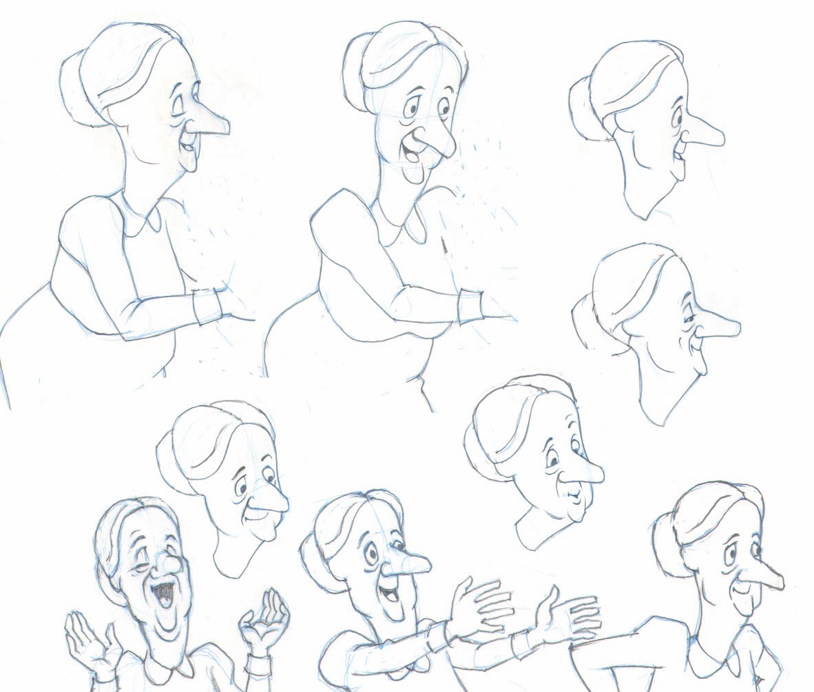
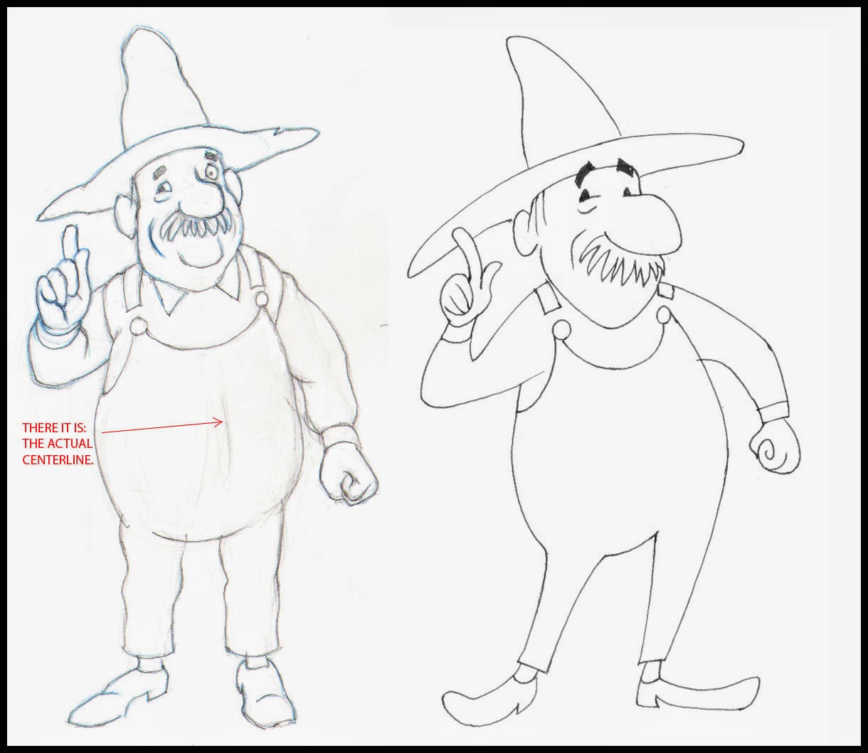
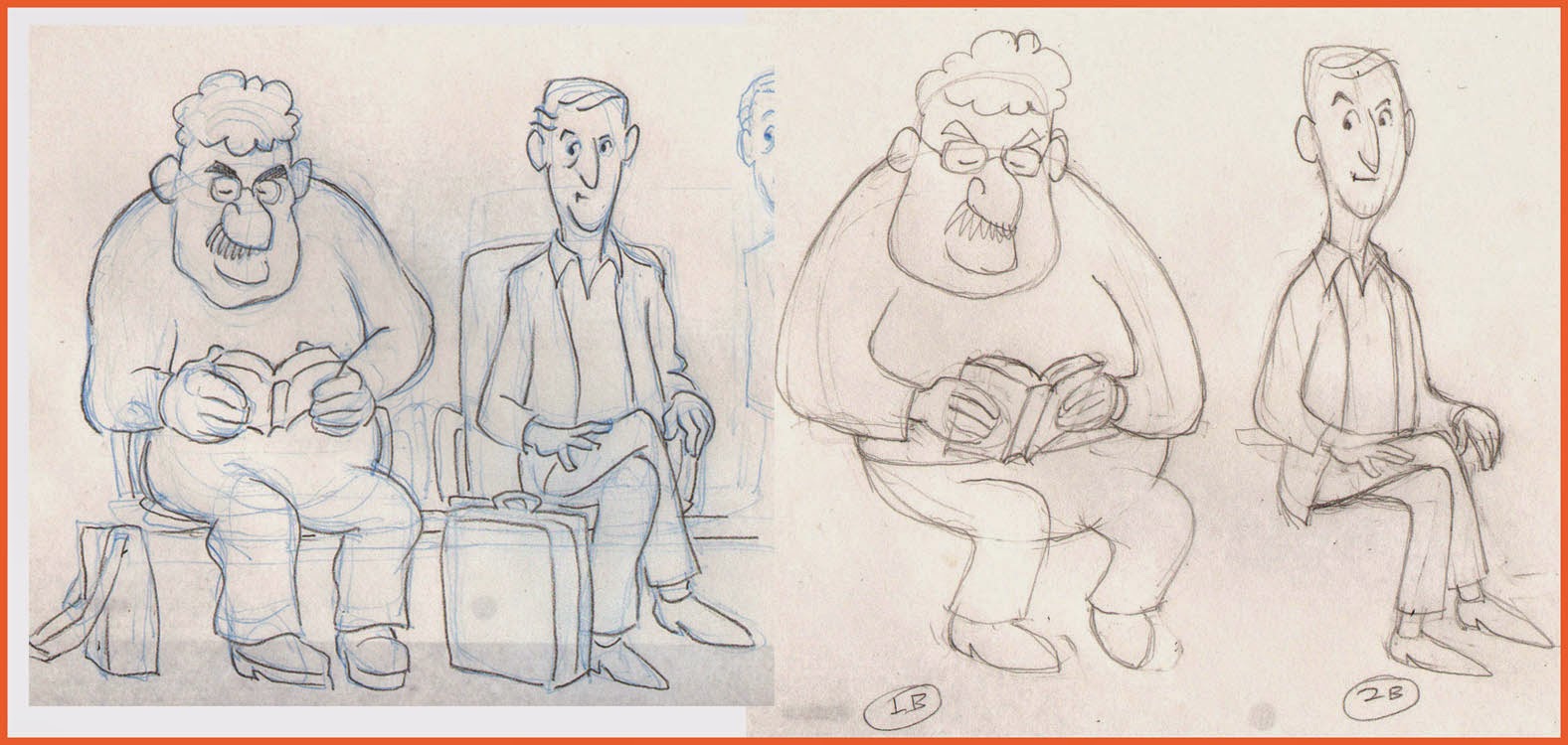
 Using as my test project the concept I call The Two Washingtons, the same one for which I have recently recounted my character design process [Acme Punched! posts no's 64 and 65], I started by writing a script complete with dialog and camera directions, during the course of which one of the two main characters changed completely in concept and had to be re-designed (see below.)

A change in character often necessitates a change in design.


The script notations included a sequential number for every scene (or camera shot, as it is called in live action.)  My script had 24 scenes, so when I opened StoryBoard Pro for my new project, I laid out 24 scenes and copy-pasted the directions for each scene from the script into the Action Notes box in the Panel View.  (I should note that as I write this, some of the staging for what is now scene 24 is unclear in my mind, and so I expect that when I get to that point in my storyboard, it will end up being divided into several more scenes. But the flexibility of StoryBoard Pro facilitates changes, just as in a paper storyboard, easily allowing additions, rearrangement and deletions, so this does not worry me.)

A section of page 1 of my script.

The script for Scene 1 pasted into the Action Notes window in StoryBoard Pro.


Using a written script may not be the best approach for everyone.  Some may prefer to work from the outset with visual representations of the scenes, but I have some experience in writing fiction and live-action scripts and so it appeals to me as the right way to begin.

Thumbnails

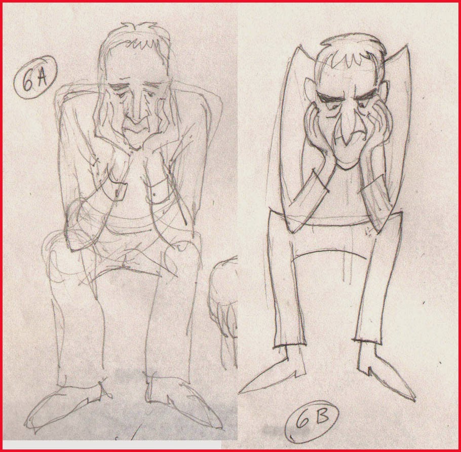
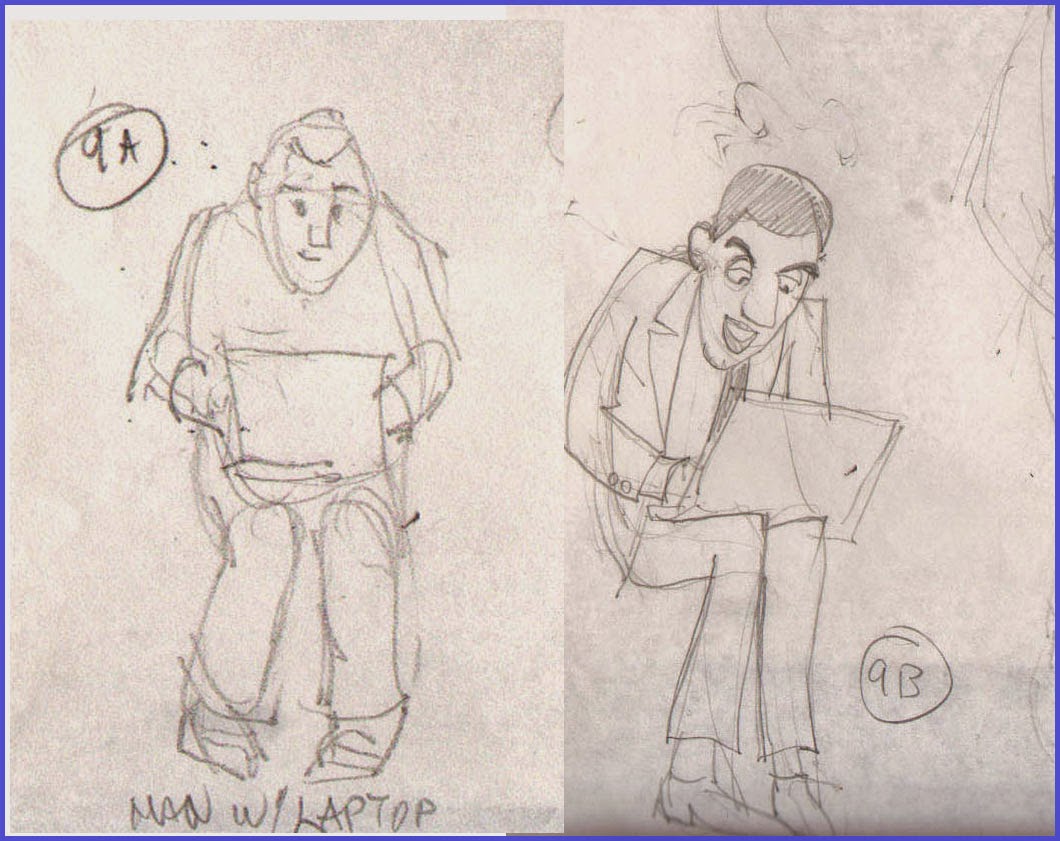
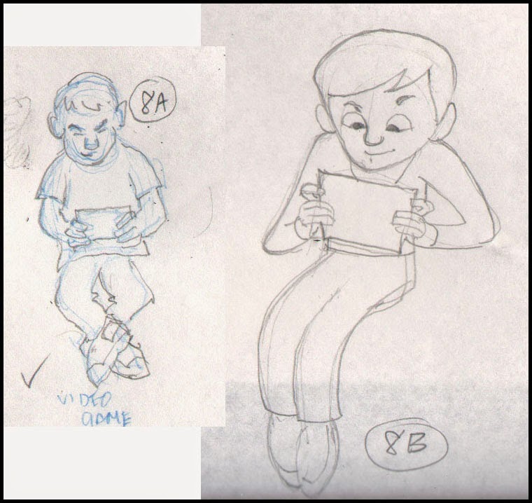
Along the way I was making thumbnails on paper which I kept before me as I worked. These were just quick sketches, only a few inches or centimeters high,  of poses and situations that I was visualizing as I worked through the script, and which I jotted down quickly without regard for character accuracy or precise drawing.  This can be a valuable way to work, and I recommend it.

Early thumbnail sketches.


Bitmap or Vector?

 The StoryBoard  Pro application allows drawing in either bitmap or vector modes, though not both on the same layer.  The default layer choice is vector (I did not find a way to change this), and after some experimentation I found this to be preferable because of the smoothing property, a feature found in many vector drawing apps.  This property may be set at any percentage from 0 to 100 and will help remove shaky or hesitant tremors in any drawn vector line. I like it set at around 20 most of the time, but this will be different for each artist.  Setting the smoothing very high, however, can cause the algorithm to redraw your line without any of its original character, so this should usually be avoided.

Testing three settings of the Smoothness property in vector inking.
Here I inked one rough drawing three times, using no smoothing, 50% smoothing and 100% smoothing, as indicated.  If you look closely, you can see that the 0% setting gave me the most faithful rendering of the rough, yet it contains some nervous lines at the top of the cap.  At the other end of the scale, the 100% setting straightened some curves completely (under the eye and at the mouth) and made very small detail almost impossible to render.  Drawing a round pupil in the eye was not possible, and getting it as good as I did required 4 or 5 repeated strokes.  Even the 50% version was taking too much control of the line to suit me.

Another advantage of vector inking, or course, is that the lines remain crisp at any scale.

Keeping It Rough

 With the idea of ending up with not just a storyboard but an animatic, I found that a good way to work was to go through the entire board in very rough form, using separate layers for whatever elements in the scene will be shown to move or change. 

In the course of roughing out the storyboard, new ideas for movement, transitions or other changes will naturally present themselves. If you are working rough, it will be less painful to create the necessary layers or panels to accommodate these new things than if you were working in a more finished way.

Rough storyboard panel.  The black rectangle is the camera field, which will be adjusted later.
I have roughed in more than half of this storyboard as of this writing.


Next: Part 2, The Hybrid Approach


No. 70, Me vs Toon Boom StoryBoard Pro, Part Two

$
0
0

The Hybrid Approach

 I still like drawing on paper.  Are you surprised?

Last time I featured mostly images that were drawn directly into StoryBoard Pro with a stylus and my Wacom tablet.  As I continued my exploration of SBP, I found that some complex setups were, for me, better done by working on paper, then importing the image into the program.  Could I have done them paperless?  Yes, but I think it would have taken me a longer time, and storyboarding is often required to be done quickly and efficiently.

Each user should make her or his own decision about this.  Yeah, I am an older guy with a long history of composing my work on paper, so that is my inclination.  If you grew up with computers, it will likely be easier for you to go all digital, and your results may be just as good that way.  I have plenty of respect for the all-digital artist.

However, Toon Boom has not neglected us paper-bound animators.  They have always accommodated import and scanning of hand-drawn and bitmap images of all kinds, including color images.

Smart Use of Your Smart Phone

My own procedure with animation drawings has been to scan them in with a Mustek scanner, with the Acme punched (there's that term again!) paper registered to a taped-down acme peg bar attached to the frame of the scanner, outside the scanning field.  For storyboard images, I could do something similar, but I have realized there is an even easier way.

A smartphone plus drawings equals easy import of rough pencil drawings.


Laying the drawings out flat on my desk, I just stand up and shoot photos of them individually with my iPhone.  Then I connect the iPhone to my laptop, open iPhoto, import the images, and copy them from iPhoto into a folder.  They come in as jpegs, and from there I can import them directly into SBP.

The raw smartphone image.


However, I do sometimes add one more step, which is to first bring them into Photoshop, crop them to get just the part of the image I want, and manipulate the brightness and contrast.  It is faster than using the scanner, and you can do it in a coffee shop or anywhere, with only your laptop or tablet plus your smart phone.

The same image brightened and cropped in Photoshop.


I would not use this method for any precision image such as a background layout because there can be slight distortions in perspective and proportions, but in the rough and sketchy world of storyboards, the results are perfectly acceptable.  You can still use that image as a rough layer, re-drawing the appropriate parts of the image onto separate layers using the SBP drawing tools.  This is what I refer to as the hybrid approach--combining imported rough pencil sketches, with final drawings made using SBP's drawing tools on layers above.

Try it!

The imported image partially inked with SBP drawing tools.


Exporting the Storyboard to PDF


I had a question from a reader this week about exporting from SBP to PDF; specifically, how to do it so that the Dialog  and other written notes would export and appear with the panels in the PDF.  Exporting to a printable format is of course often a desirable way to share a storyboard, making it possible for individuals to make notes and suggestions on paper that may then be considered as revisions.

I did some experimenting and found that this will work only if you choose certain options under PDF Export Parameters in the Export to PDF window.

The Export to PDF window, with 3 Panels Vertical selected.


My findings are that the first four options--3 Panels Horizontal, 3 Panels Vertical, Full Page (one panel) and Overview 2x4 Panels--all will include any notes or dialog in the PDF.  The others--Overview 4x3, Overview 8x10 and the Japanese formats--apparently will not.  These formats include so many panels per page that there is no room for the notes.

Caution:   In the formats that will include notes, if your notes run especially long, they will still be included, but at the expense of bumping one or more panels onto the next page.


Next:  Storyboards That Move!


Viewing all 184 articles
Browse latest View live